KEVIN.MURPHY HOLIDAY 2020
CONCEPT
After seeing Dutch paintings of delicate and muted flowers from the early 17th century at the National Gallery in London, we wanted to make something really very special. Something that had the layered richness and holiday stark warmth of the flowers pictured.
We decided to photograph lush flowers as portraits, to look as if they were paintings. We used these to print lavishly on the inside and the outside of our product boxes. Though the use of florals lent itself to the old days, we chose to update the collateral by using elaborate fonts in bright primary colors. Mixing yellow and blue, and pink and green. Our inspirations for the colors came from the 1980s when mixing pastel with primary was most popular. The final result was one of visual layering.
B-ROLE
Packaging Production Design
Photo & Video Art Direction
Content Series Strategy
CREDIT
Packaging -
Design & Art Direction: Briana Espinosa
Social Media Design: Martyna Marcenkovaite
Marketing Team: Sanaz Enshaian & Jennifer Bartee
Photography & Videography -
Product Photography: Paul Tilinghast
Product Styling: Andrew Spargo
Videography: John O’Rouke
Video Product Stylist: Emily Ward
Packaging Design
BTS
Behind the Scenes
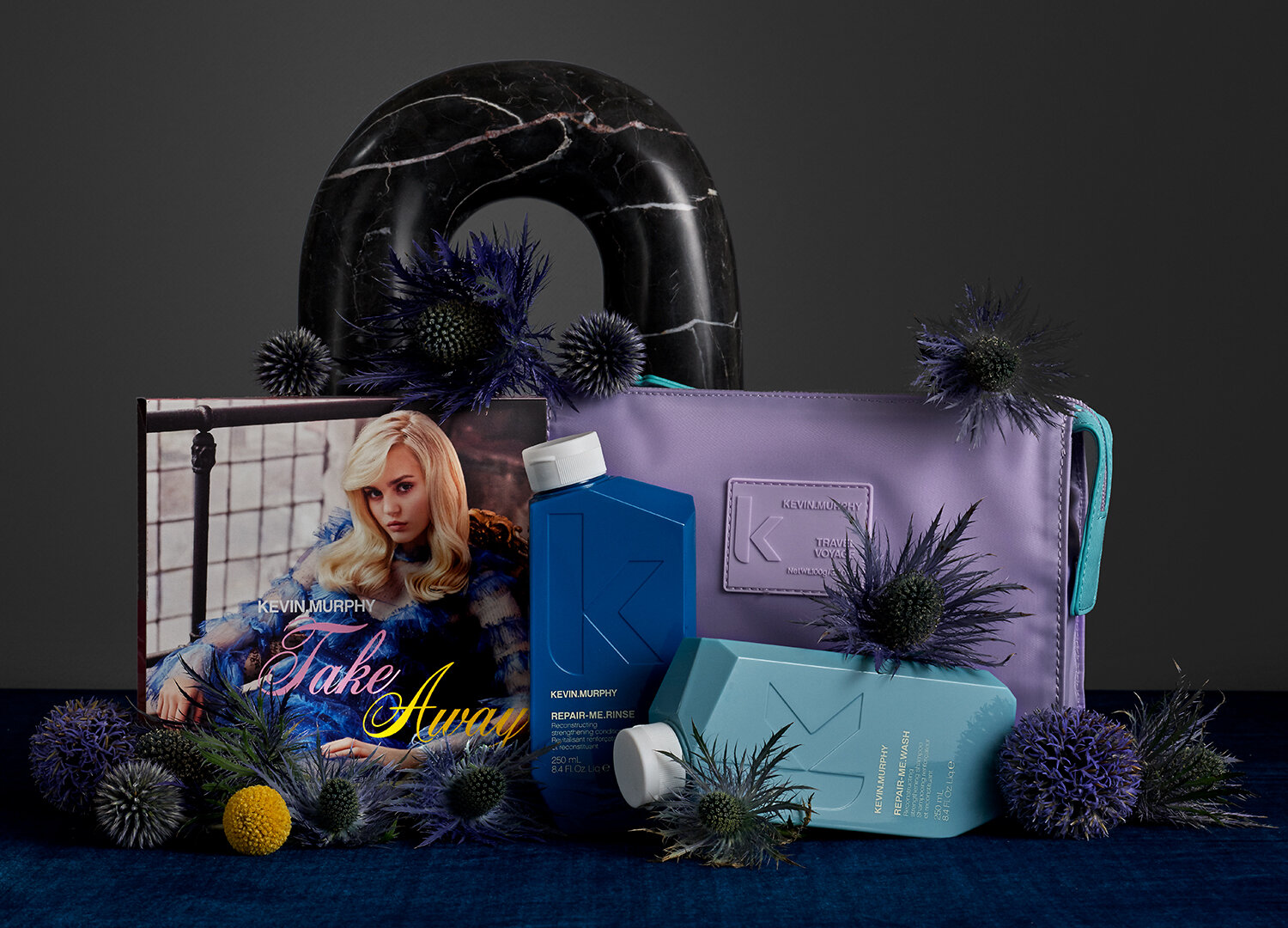
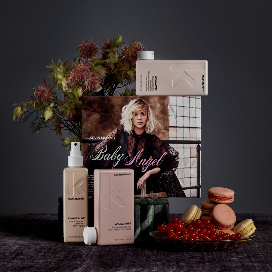
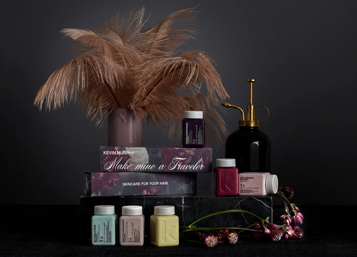
I was tasked with taking Kevin’s varied inspirations and creating cohesive packaging design for our Holiday Packs. I also art directed the shoot which was inspired by 60s Biba fashion. I titled this concept - Eclectic Minimal. As a brand, we like to keep a very minimalist look, but this time we explored more elaborate set design through a color palette of deep jewel tones, velvet fabrics, feathers, and brass props. Our goal was to create a moody and luxurious vibe, while remaining festive for Holiday.
Social Assets
For social media we wanted to create the same visual layering designs but for instagram carousels, adding quotes from famous poets to stick with the romantic floral theme.


