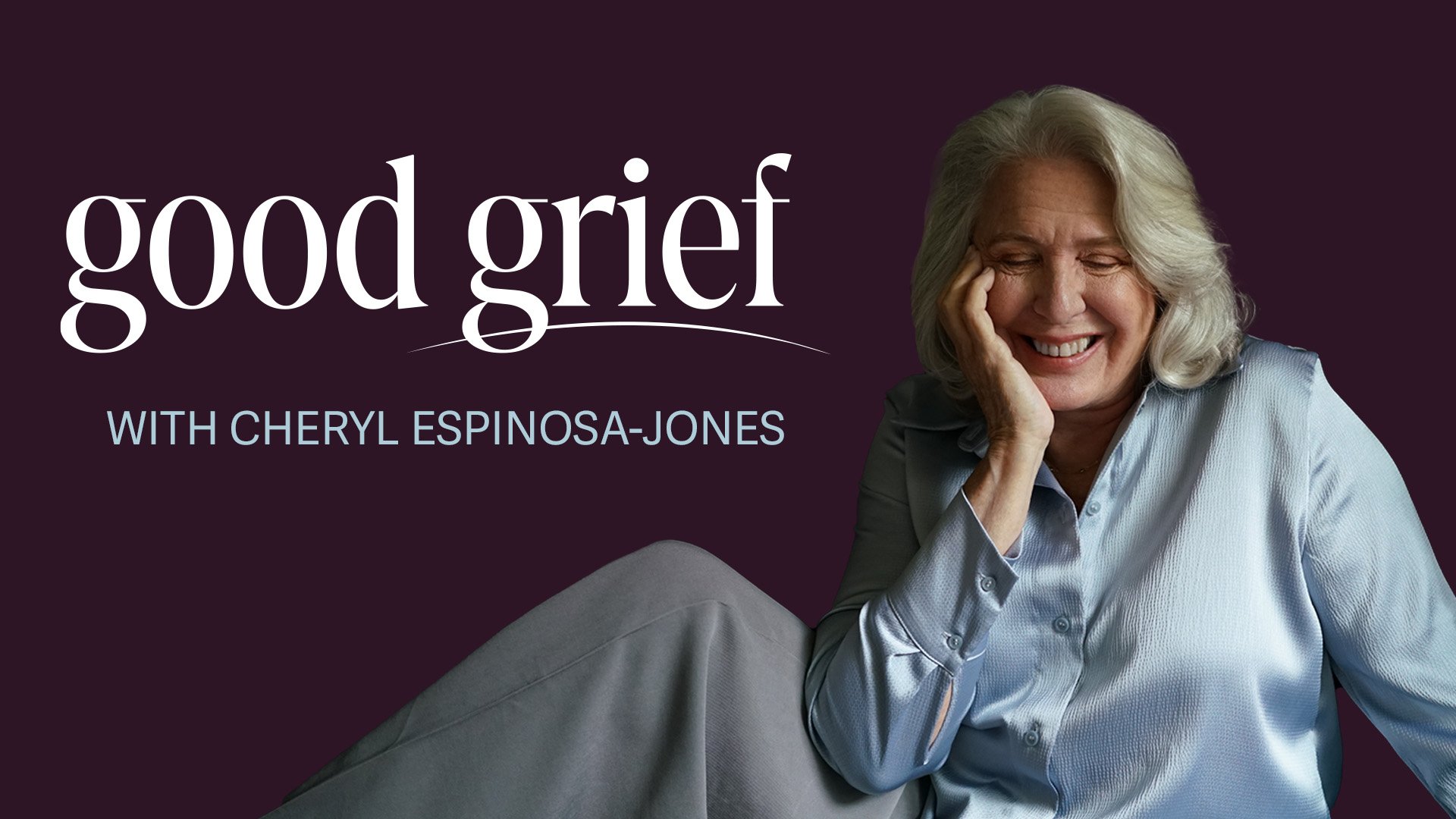
GOOD GRIEF
CONCEPT
Good Grief with Cheryl Espinosa-Jones has been a live radio show for over 10 years on VoiceAmerica Radio. Cheryl is a grief therapist who interviews those who have faced grief to share their story. Cheryl’s 10 year anniversary was coming up and the radio station asked Cheryl to take a look at the podcast branding. The move was a fitting time to take a look at the podcast branding. The existing look and feel of Good Grief looked outdated and didn’t hold the essence of the show. Cheryl asked me to help with the rebrand to achieve a more refined, modern, and elevated look and reflect the heart of the people she interviews on the show. It was interesting to define what Grief could look like. My goal was to create a brand that was professional, inspiring and up-lifting.
Website: www.goodgriefwithcheryl.com
B-ROLE
Discovery & Strategy
Logo & Identity System
Marketing Copy
Type and Color
Cover and Episode Art Templates
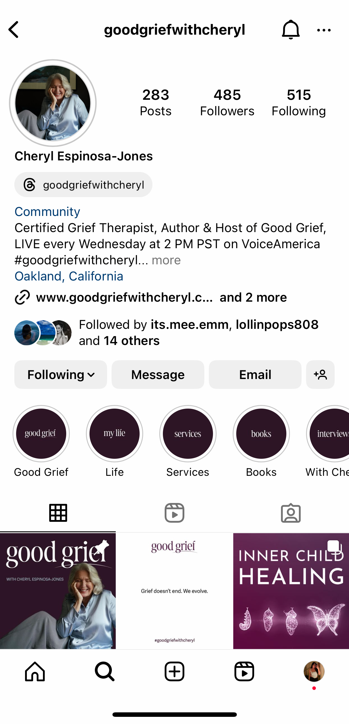
Social Media Strategy & Templates
Website Design
CREDIT
Design & Art Direction: Briana Espinosa
Photography: Jalena Keane-Lee
New Logo
Good Grief’s primary logo is vibrant, approachable and flamboyant in design. Good Grief is the name and the logo is primarily made up of two elements: our wordmark and the underline.
Symbolism: The downward curved underline is designed to highlight the word “grief” and also look like a sad face.


